


£10k and 3 days in LA. My Journey to Building Torsa's Brand Identity.
Explore the journey I took building the Torsa brand identity, including a 3-day trip to LA to meet a branding heavyweight.

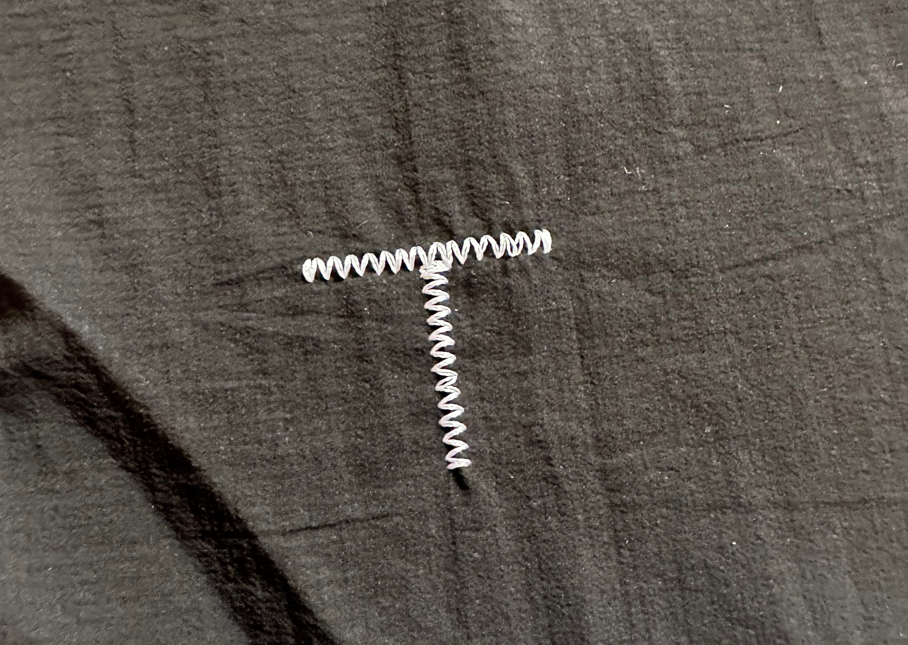
With storms hitting the Atlantic earlier this week, it’s brought with it heavy winds, and because of that, no surfing here in Portugal. That said, it’s meant that I have been able to fully focus on Torsa, with second prototypes in the works - there has been a lot of questions from our factories and thankfully my product developer has been on hand to clear up the questions and concerns they’ve had. I also received the final strike-off for our new embroidered T mark, which I could’t be happier with. You may be surprised this took 4 rounds off strike-offs to get right - we ended up testing different thread weights, machine tension, embroider settings, and dimensions.
This T feeds in nicely to today’s topic which explores an in-depth look into building our brand identity.
Topics
✈️ Why I chose to fly 11 hours for a 3 day trip to Los Angeles
🧪 Decoding the Aesop brand, and how it became a billion $ company
📝 The importance of a brief to build a foundational understanding for brand
☀️ How the sun became the core of Torsa’s brand identity, and the meaning behind it
🔮 Why being crystal clear on your brand values and mission will have a huge impact on the success of your brand identity
Why building a strong brand identity goes so far beyond just a good logo
As I struggled to keep my eyes open at the hands of severe jet-lag, I made it to 7pm before I called it a night. This was the result of an 11 hour day flight which took me from London to Los Angeles, California - in which, I was only staying 3 days in the Venice Beach neighbourhood. So the question is, what brought me embark on such a journey?
I was in the midst of working with Benjamin Critton, a graphic designer, creative director and typography heavyweight, responsible for the custom typeface of Reformation Jeans, the packaging behind byHumanKind, and creative direction at Outdoor Voices.
These projects, amongst countless others, cemented Benjamin as one of the most sought after graphic designers in Los Angeles, and I was desperate to work with him. Although my trip was after we started working together, the reason for my visit was simply to meet him, build the relationship, and sit down in his studio to brainstorm and refine Torsa’s brand identity.
Branding Spotlight
I’ve always been a sucker for branding. The power of brand is undeniable in the modern world. I have, and will continue to do so, make decisions based on brand, not just product. It’s human nature for us to be drawn to certain brands, and the graphic identity, creative direction and brand visuals forms a huge part of that. It’s why I decided to invest so much money, and make an 11 hour flight, just to make sure I got it right.
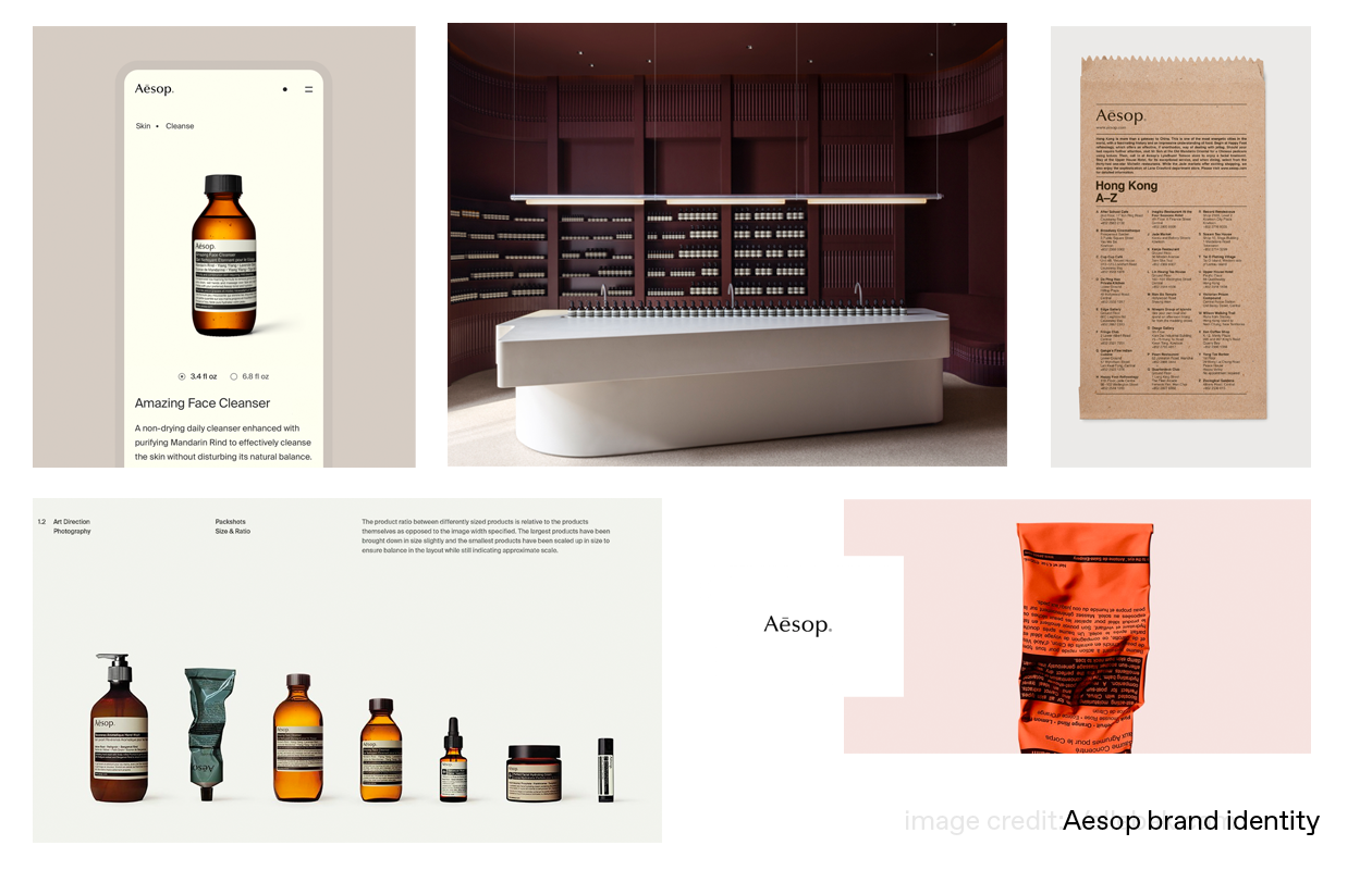
Think about your favourite brands today. I can almost certainly guarantee that you were influenced in some way by the brand itself. Let’s look at an example from a sector I have discussed before; skincare.
Case study: Aesop
With its muted colour palette, minimalist labels and unique in-store retail experiences, the Australian brand gained a cult following in the lead up to its $2.5bn acquisition by L’Oreal.
Aesop didn’t solely build it’s success through its product, it built it through brand. Through consistent visuals, colour palette, design language, brand positioning and store experiences, Aesop managed to obtain something which is very hard to achieve in such a crowded market; ultimate aspiration.
People don’t buy a £30 hand soap because they like the smell. They buy it because of how it represents them as a person, and this all stems from the brand - whether that’s the customers perception of that brand, or the perception that the customer believes wearing/using/having that brand projects on others.
Creating a strong brand goes so far beyond just a good logo. It’s elements such a consistent design values, brand positioning, harmonious messaging, memorable campaigns, unique art direction, brand visuals, and so much more.
My journey in creating Torsa’s brand identity, like all things, must start at the beginning.
The Brief
Embarking on the brand identity journey, and much like other design projects, it all started with a brief. Although I no longer have the initial document I sent to Benjamin, I remember supplying as many visual assets as possible that resonated with me, and what I wanted to build.
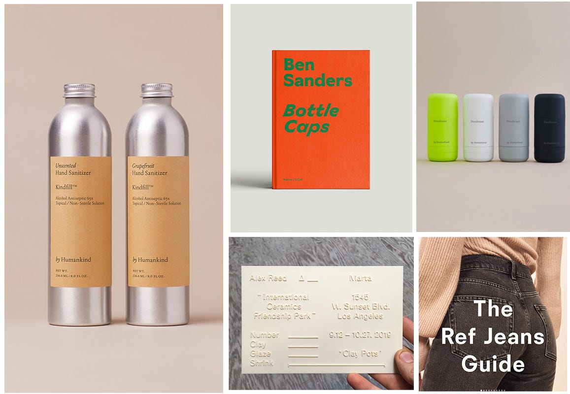
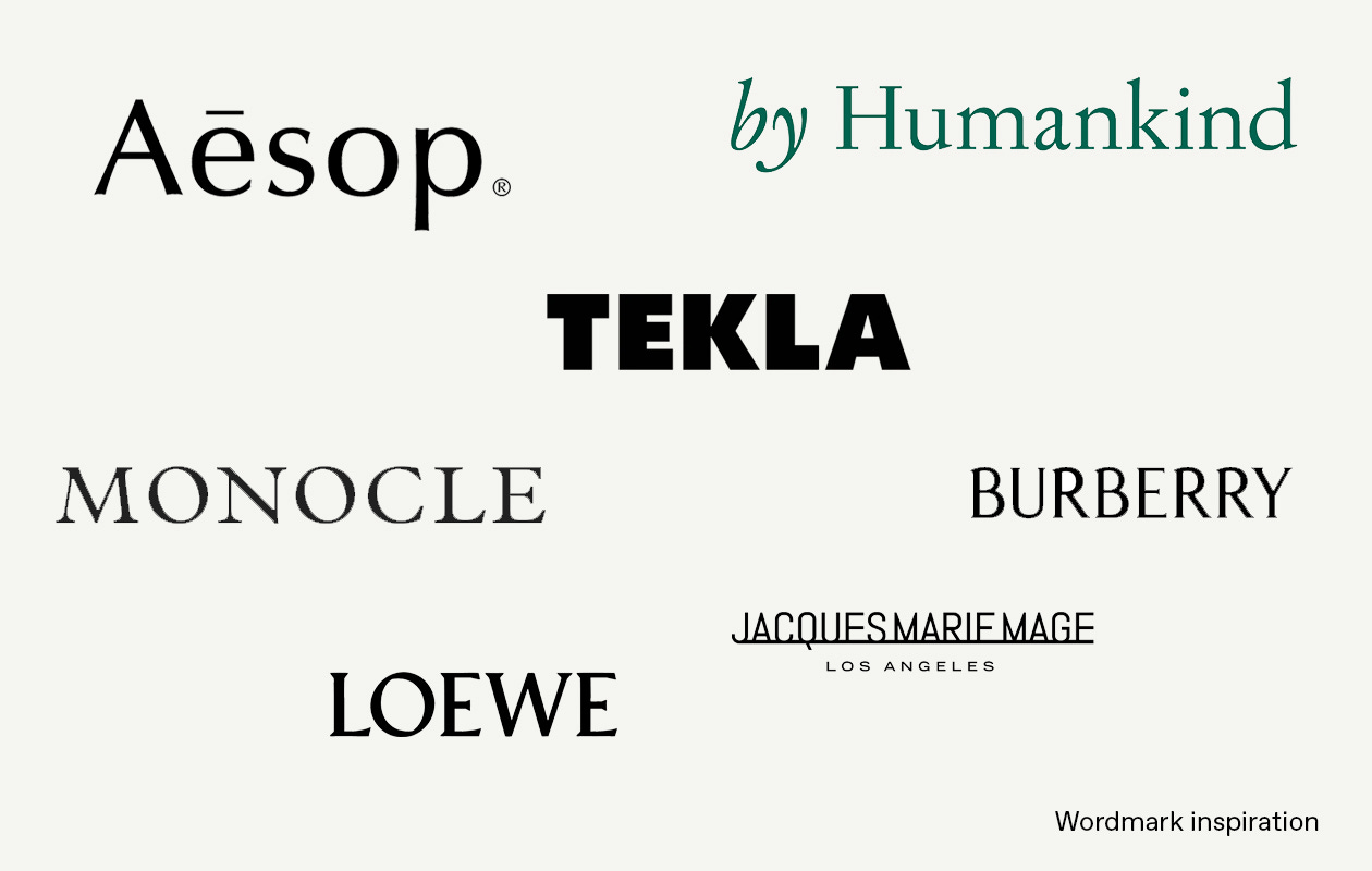
These would have been a series of visuals that inspired me including brands that I found aspirational. I would break it down into categories, for example, I’d have a moodboard of wordmarks that I was drawn to such as the below;
These moodboards, however, weren’t a strict indication of what I wanted him to build - they were merely a guide. I wanted to give him the creative licence to build something unique to us, but providing the visuals that I liked was a great foundation from him to build from.
Insider Knowledge
What I have come to know is that the real value when it comes to building a brand identity comes from your ability to translate the why behind the brand - why do you exist? What is your ethos? What is your mission and vision? Where do you want to be positioned in the market? Who is your customer? What is your messaging?
I came to Benjamin with our mission “to inspire people in the pursuit of greatness.” This, paired with my Scandinavian heritage and subsequent love of Scandinavian design, along with my admiration of Japanese design principles, he set off creating what became known as Torsa-ID-Rnd-1.
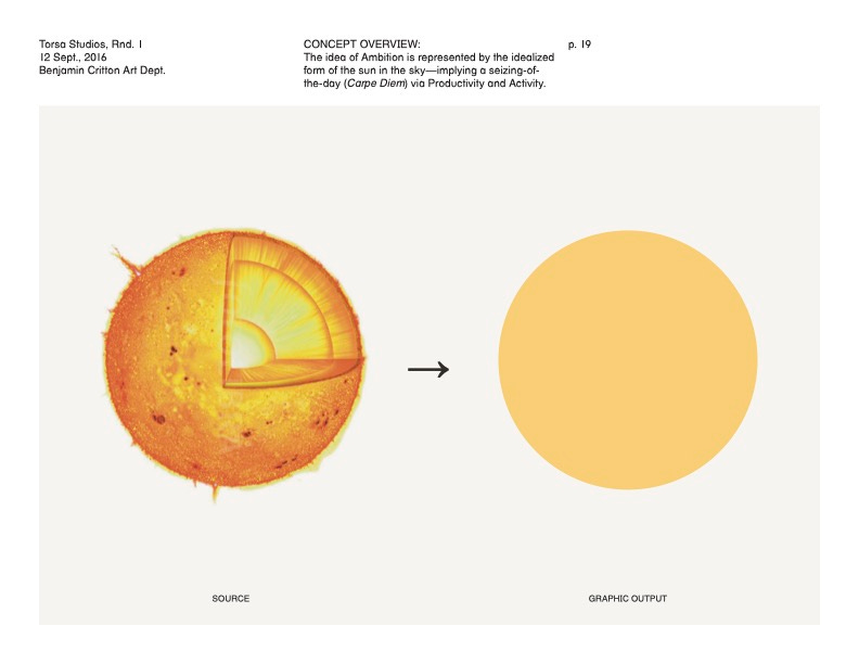
The Sun-as-O
The Sun-as-O - one of the two concepts which was presented to me - and ultimately the one I chose, was a perfect representation of what Torsa was all about. The solid O, which can be seen in our wordmark has a deeper meaning which comes from the idealised form of the sun in the sky;
Later in the process, in our final brand book, Benjamin would discuss the meaning of Torsa - guiding us through the initial acronym all the way through to it’s modern day meaning, which came about through discussion, development and refinement.
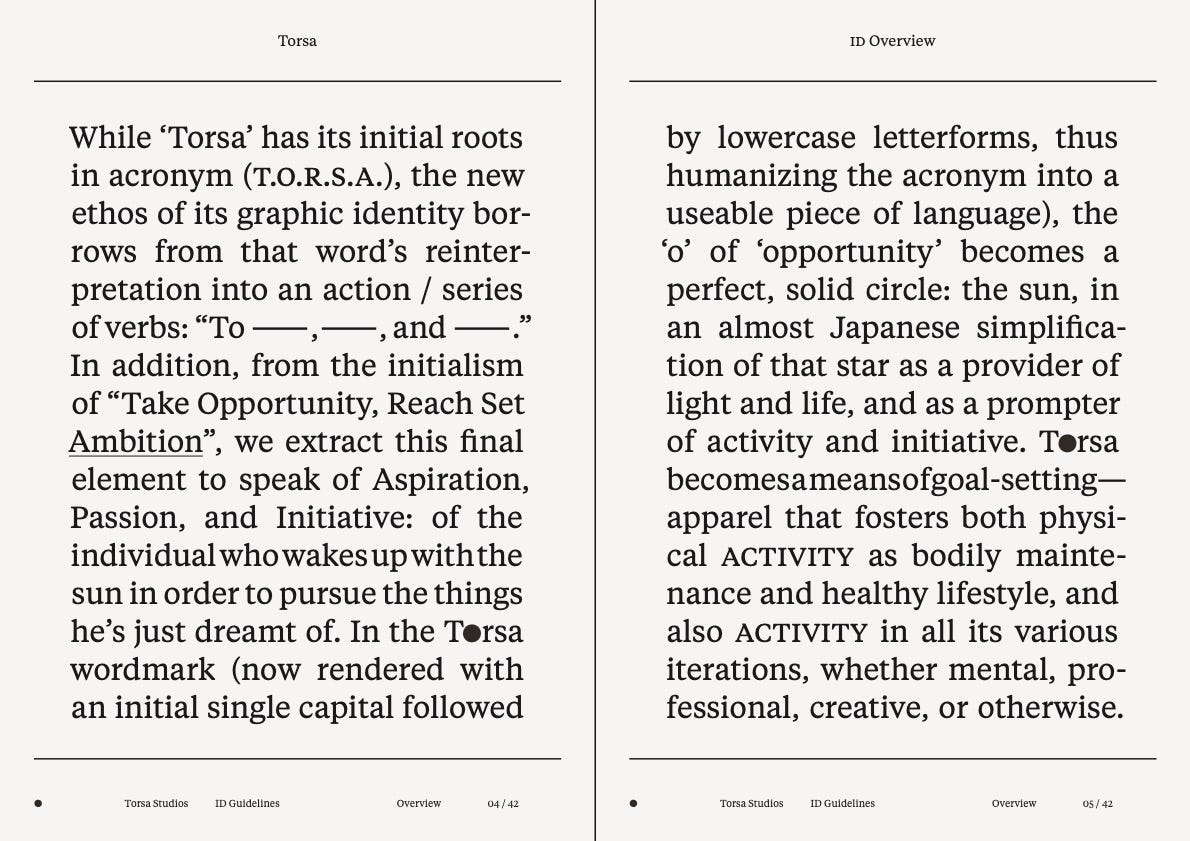
Although I have jumped ahead, I felt it was important to show how brand identity develops. When I first came to Benjamin, I had Torsa as an acronym of “Take Opportunity, Reach Set Ambition.” After the Sun-as-O concept was presented to me, I realised the strength of leading with the O concept, rather than Torsa’s acronym. Torsa is still an acronym - “To Rise, Sweat and Achieve” (TO.R.S.A) but it’s not something we actively use in our messaging.
The Sun-as-O concept resonated with me because of it’s simplicity and its link to the Japanese sun (seen on their flag). It was the deeper meaning, however, that really sold me. This idea of the O of opportunity becoming a perfect, solid circle: the sun, as the provider of light and life and the prompter of activity and initiative. This was it. This is what the pursuit of greatness was, wrapped up behind this beautifully thought out graphic identity.
Moodboards
All before the O was established, alongside this concept, Benjamin presented moodboards of both ‘Mood’ and ‘Graphic Palette’ which explored colour, application, tactile possibilities, and print examples. You can see snippets from these below;
Mood


Graphic Palette


This helped provide inspiration and an exploration into the start of Torsa’s graphic identity. The moodboards included many elements that I really liked, and some that I didn’t like, which I would share with Benjamin before Round 2.
Of course, if you’re familiar with Torsa as a brand, you’ll know I didn’t proceed with the black, off-white and yellow theme, opting instead for what has become known as our signature lilac. However, when I look back at how good it looks on these moodboards, I sometimes wonder what might have been.
The Wordmark
The Torsa wordmark can be seen as the backbone to our brand identity. This is the asset you’ll see us use most across our campaigns, messaging and graphic output. Benjamin and I worked hard to get this right.
Benjamin initially presented two distinct options which involved the use of the solid O to complete the O of Torsa. This was an element I know I wanted, so it was now a case of finding the right font that represented Torsa.
The initial deliverables of the Torsa wordmark can be seen below;
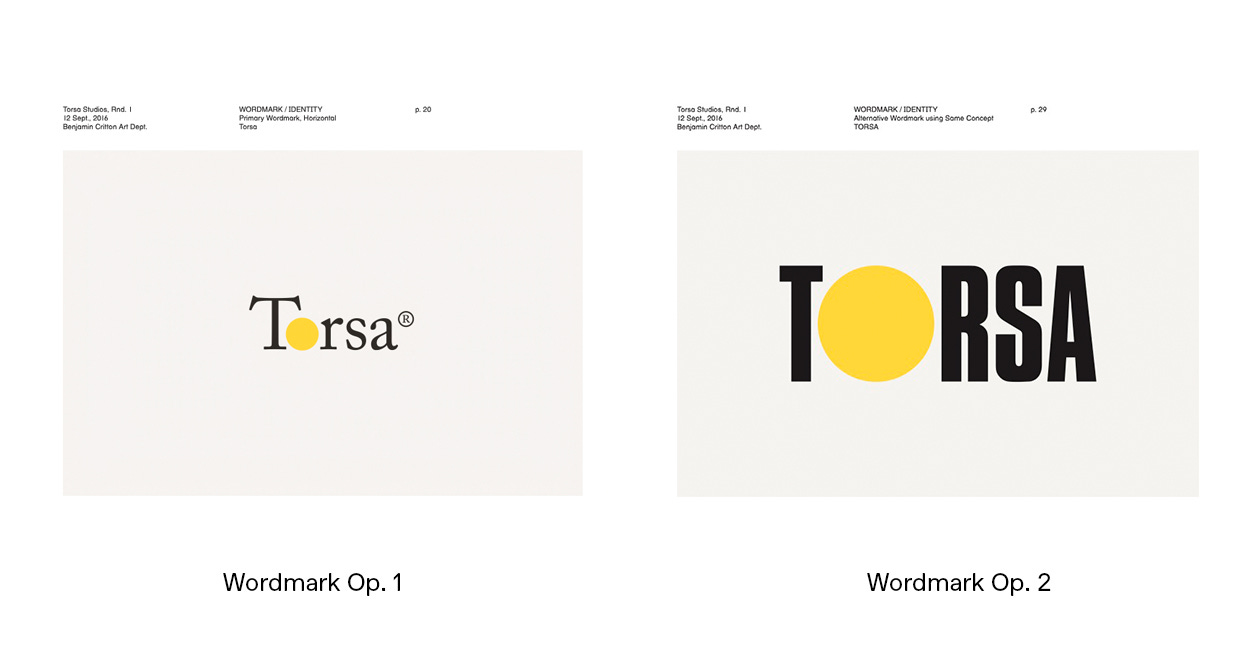
Although at the time the Sans Serif contemporary wordmarks were going through a huge moment, Benjamin explained how the serif font - characterised by a slight projection finishing off a stroke of a letter in certain typefaces - seen on the wordmark on the left, was intentional.
He described how the more technical nature and intricacy of a Serif font could link back to the technicality of Torsa’s clothing. I loved the idea, but felt like the wordmark was just a little bit too playful - so he cracked on with Round-2 with my feedback and came back with what I believe was the perfect typeface for Torsa.
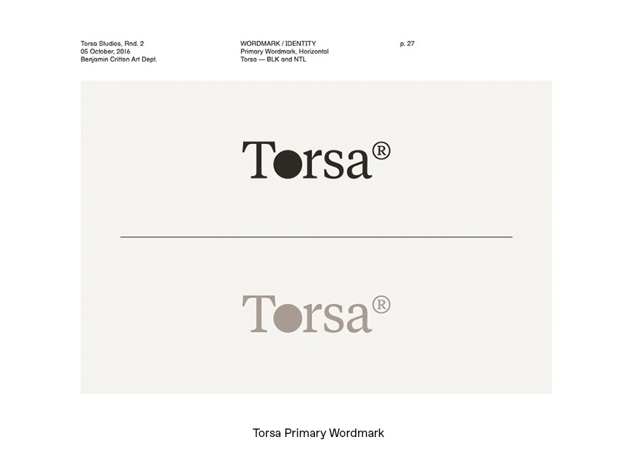
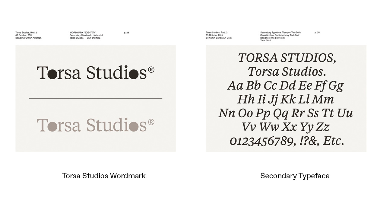
For me, immediately, everything felt right about this typeface. It was contemporary and modern, yet unique. It felt like the solid O worked perfectly and I was so happy with the outcome.
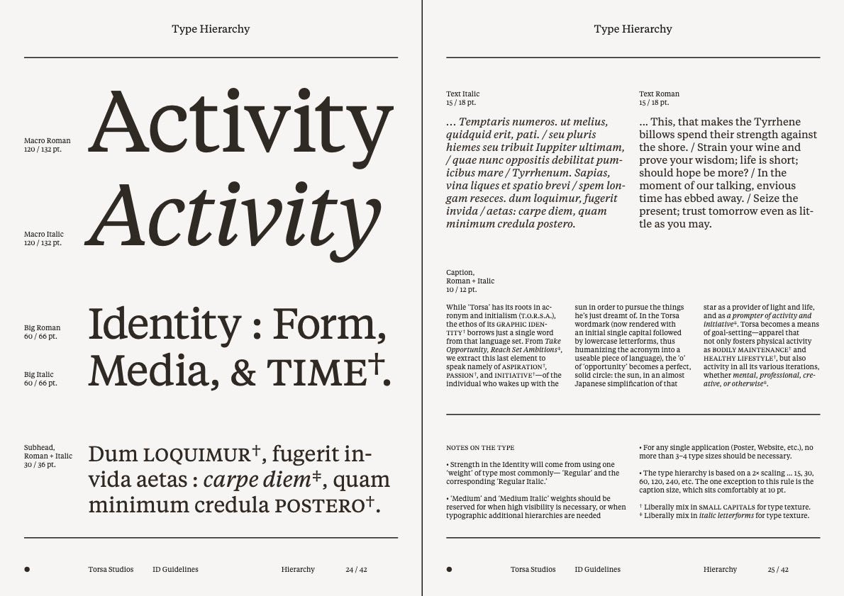
In the final brand book, Benjamin would go onto demonstrate type hierarchy, when the typeface should be used, scaling, type texture (all things which were very alien to me of course), but this is what masters in their field do; make things simple to understand.
Mantra and Acronym
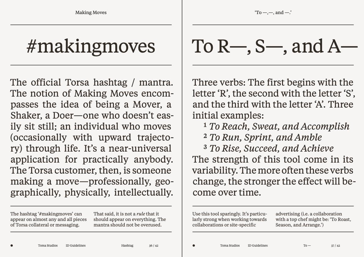
As part of the scope, Benjamin would also come up with Torsa’s mantra or hashtag, which could become associated with the Torsa brand. After brainstorming in the studio and deliberation in his LA studio, we landed on Making Moves - the idea of being a doer, someone that doesn’t sit still and is always looking to improve and change for the better.
The acronym for Torsa which I touched on earlier can also be manipulated based on the situation. The strength, Benjamin noted, in its variability and should be used sparingly, which is why you may have not seen it across much of our messaging.
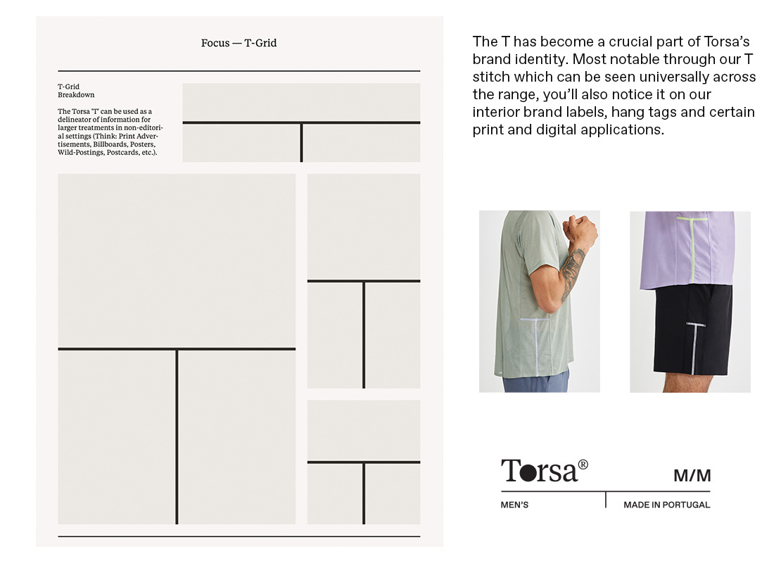
The T Mark
What has become our strongest brand identifier, the T mark origin was in fact a delineator of information (for print, billboards, posters etc) . As the project progressed, and I expressed my desire for something other than a traditional logo, we discussed how the T could become our main ‘on-garment’ brand mark.
The T - from Torsa - but also devised through our lesser known brand mark was the perfect identifier in my eyes for the brand. It could be applied through design lines, seam placements, and stitching, and its subtlety represented the design values I wanted Torsa to be known for.
Final Thread
When I embarked on my branding journey, this was right at the start of creating Torsa. When I initially came to Benjamin, I wanted him to create a brand identity that reflected work similar to what he did at Outdoor Voices - which was a more playful active lifestyle brand. However, as Torsa took shape behind the scenes and I realised I wanted to create a technical activewear brand rather than ‘athleisure’ brand, it meant the brand identity had to change somewhat.
If you remember, Benjamin presented to me a couple of more playful Serif typefaces as potential options for our Torsa word mark. The reason he presented these was because of my initial brief of being a more ‘fun’ brand so to speak. It was only when I truly understood the direction and core essence of what I wanted Torsa to be that it started to feel more like, well, Torsa.
The reason I mention this is that it’s one of the most crucial parts of building a brand identity. Before you start your journey on brand, be crystal clear on what your brand represents; Why do you exist? What are you creating? Who are you creating this for? What is your mission and your core values? This, alongside your visual brief will ensure whoever you’re working with has a clear idea on what it is you want them to build. In any aspects of business, whether it’s branding, product development, marketing - constantly changing your mind is one of the worst things you can do for progress.
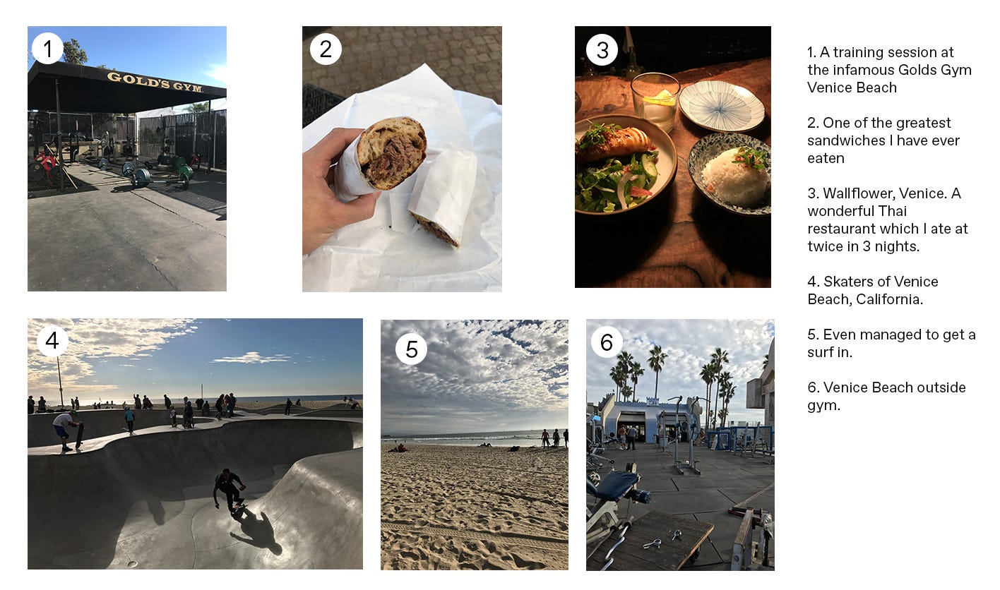
I will forever be grateful for working with such a masterful creative, and all round fantastic guy, and Torsa’s brand identity is something I am hugely proud of. To sign off for the week, here are some things I managed to cram into my 3 days in LA.
What is a cost range for brand identity development?